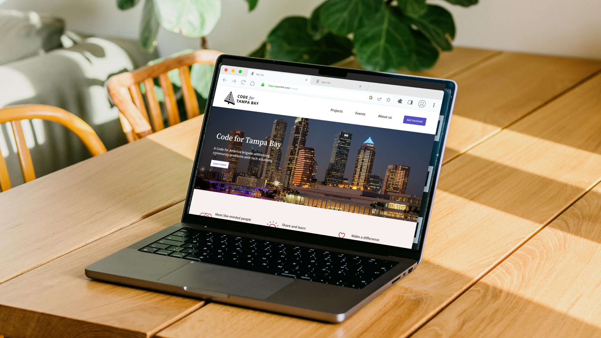
Code for Tampa Bay
Responsive website redesign for a local civic tech organization
Improving the volunteer experience in civic tech
Code for Tampa Bay is a brigade chapter of Code for America, a non-profit organization whose mission is to address the widening gap between the public and private sectors in their effective use of technology and design. Their website needs a redesign to attract new volunteers and convey a stronger organizational image.
ROLE
UX Design, UI Design, User Research
TOOLS
Figma, Maze, Zoom, Otter.ai
TEAM
Rana Asadipour, UX Designer
Frank Perez, Stakeholder & Web Developer
CONTEXT
Website redesign
Background
What led me to this project
When I started as a Code for Tampa Bay volunteer, it became apparent that the organization had difficulty staying active. Upon discussion with Frank, the co-brigade captain, it became clear they needed a redesigned website.
What is civic tech?
Civic tech is technology that is created for a social good. It’s generally pro bono volunteer work by skilled tech professionals serving local non-profit or government organizations.
Problem
There’s a lack of volunteers with tech and management skills
Finding volunteers can be difficult, and civic tech organizations like Code for America brigades are asking people with skilled tech backgrounds to commit their time and expertise.
Challenges for prospective volunteers
Information about projects, events, and open roles is outdated, unclear, or missing. Onboarding, project roadmap, and time requirements are vague.
Challenges for the organization
The website is not kept updated with current projects and open volunteer positions. They struggle to find enough volunteers to tackle the existing project proposals, nonetheless take on new ones, and they rarely receive donations.
Solution
A redesigned website centering information for volunteers
For prospective volunteers
Make the volunteer onboarding process transparent and easy to start
Show project details and links
Information about the organization and leadership
Sense of branding to strongly convey purpose
The organization
Informative website that will bring in new volunteers and project proposals
Easily updated project section
Events page that can be updated when they’re happening, but not look empty when they’re not
Discovery
Learning more about Code for Tampa Bay
I kicked off the project by interviewing the co-brigade leader to learn more about the organization’s goals, needs, and pain points.
USERS
Current and prospective volunteers (developers, designers, project managers, etc)
External stakeholders (community orgs seeking support in their projects)
PAIN POINTS
The brigade’s mission is commonly confused for being an organization to learn to code
There isn’t a way to easily register potential volunteers and their skillsets
Current volunteer onboarding is a manual process through email replies and setting up a meeting to discuss interests and goals
WEBSITE FUNCTIONS
Easy to navigate
List of projects (active and completed)
List of volunteer opportunities
Explain the brigade’s mission
TECHNICAL REQUIREMENTS
Easily updatable with good documentation
Has to be responsive and accessible
METRICS
Web traffic to site and particular pages
Compare how many people visit the site versus volunteer signup inquiries
Number of active and completed projects
Website audit
I assessed the existing website’s content and pinpointed some shortcomings by doing a UX audit.
I used Nielsen’s 10 usability heuristics as my guidelines for assessing the website. I highlighted the bigger shortcomings in red text to help with the redesign later.
What needs improvement
Consistency across pages, especially with navigation
Active projects could be listed in a more coherent way
Consider removing calendar and communicate events differently
Figuring out open volunteer positions is not easy
Aesthetic feels plain without much imagery or branding
What’s working
The mission and purpose of the organization is well-defined and clearly connected to Code for America.
Annotated UX audit of the current website
Who are the users?
Before creating a survey, I outlined my current assumptions about the users of this website.
I assumed they were one of the following:
Someone new to coding or design who wants practice and experience
Someone with industry experience who wants to help with civic tech projects
Local organization or government staff interested to submit a project proposal with limited budget and/or resources
Survey
I conducted a survey to learn more about the volunteer experience, and to connect with possible interview participants. I received 15 responses, and the survey gave insight into their knowledge of Code for Tampa Bay, past experience volunteering their technical skills, and connection to local organizations.
What do they expect to gain?
Impact
See a benefit and contribute in a meaningful wayNetworking
Add to portfolio/resume, get credit for their work and a referenceLearning
Opportunity to work with new technologies and learn new skills, techniques, and toolsExperience
Work on a real project with constraints
People are more likely to volunteer if:
Given specific tasks and objectives
Easy to jump in and get started
Transparent and organized structure and leadership
Projects have real impact and realistic pace
Opportunity to network
Flexible participation options
What makes them hesitate?
Time
Lack of knowledge or skills
Disorganized project
Unclear purpose
Lack of easy communication
Lack of deadline
Difficult roadblocks
Research
Research Objectives
Define the types of users of this website and their goals
Determine what other brigades are doing that is successful
Gain an understanding of the organization’s internal processes
Competitive Analysis
I studied other Code for America brigade websites since they share the same mission and function. I focused on a few of the more substantially built websites and examined what they were doing that worked well.
Strengths
Projects use tags and filters to easily find open volunteer positions
Strong sense of place in the design
Donation page with easy to use, integrated form
Pages based on user role and interest with org: Student, Non-profit, and Mentor
Weaknesses
Unclear how to become involved
Project overviews not very detailed
Conflicting information about calendar and events
Slow page loading with lots of animations
Overwhelming color scheme
Competitive Analysis showing the strengths and weaknesses of other brigade sites and similar organizations
User interviews
I interviewed people in various tech professions or management roles to learn more about their past experience with volunteering, and to get initial impressions of their experience using the current website.
OVERVIEW
4 participants
Age 25-44
Various professions (UX designer, web developer, project manager, product manager)
NEEDS
Easy communication
Clarity on role and time commitment
Clarity on mission and impact of organization
Clarity on specifics of tasks needed
Forgiveness while learning
BIGGEST ROADBLOCKS
Unclear structure or role
Disorganized projects and/or communication
Time commitment
Lack of experience
Imposter syndrome
“I'm very happy with where I am now [in my career] and I know that's due to a lot of mentorship I received along the way.”
— Interview participant
“I remember looking at Code for Tampa Bay a month ago and I was like, oh, this cool, open source, local civic program. Dead calendar - not interested. I want to do things again.”
— Interview participant
Making sense of everything
I sorted my findings from the evaluative portion of the interviews into an affinity map to get a better sense of the website’s successes and opportunities for improvement.
Affinity map of interview feedback about the current website
Provisional Personas
It became clear that there are three main types of people who use the website.
Student
Learning new skill or career path
Largely motivated by learning and real world experience
Mentor
Industry professional offering established skills
Largely motivated by sharing their skills and networking
Project submitter
Member of local non-profit or government entity
Has idea for community focused project with a tech solution
Need further research to learn more about their motivations, pains, and gains
User Personas
The interviews crystallized students and mentors as the two main types of website users.
I de-prioritized the project submitter persona, reasoning that the priority is to ensure there are volunteers before learning more about the people whose projects they work on.
Research report
I gathered all research findings into a slide deck and presented it to the stakeholder in a project update.
Define
Feature roadmap
I defined which features are required for the website to be functional to define the scope of this project.
Feature Roadmap highlighting which features the website must have, and noting other ideas for later.
Sitemap
I referenced the current website and inspected the information architecture of comparable brigade sites to outline a simple sitemap of pages.
Site map showing the information architecture of the site’s pages, including footer content.
Journey map
I prioritized Maria’s persona since experienced mentors would be needed to ensure Sam has the guidance and support he would need as a student. This journey map allowed me to take a deep dive and follow Maria’s experience as she becomes involved with volunteering.
Journey map detailing Maria the Mentor’s experience throughout the volunteer process, including her emotions and touchpoints used.
User flow
I diagrammed both the current and redesigned user flow, highlighting existing pain points.
User flow showing the current website and its pain points along with the redesigned website and its improvements.
View full size →
How might we make volunteering easier for Maria?
I used a SCAMPER ideation exercise to generate ideas about making volunteering easier. Many of these ideas are process oriented, and while the scope of this project remains focused on the website, they were shared with the stakeholder as establishing new processes and trying new things may be important to ensuring volunteer success.
SCAMPER ideation exercise exploring ways to make volunteering easier for Maria the Mentor.
UI Design
Sketches & Lo-fi Wireframes
I used the Crazy 8s method with sketches to get started with layout ideas, then digitized lo-fi wireframes using a browser-based online wireframing tool. This was very helpful in keeping me from getting too granular at this stage.
Sketches of homepage using Crazy 8s method
Lo-fidelity wireframes of Home, Volunteer, and Events pages.
Prototype
Mid-fi wireframes
I created mid-fi wireframes of the main site pages for testing. I paid special attention to the Projects and Volunteer pages to ensure the flow, layout, and quality of content was accurate before defining the visual details further.
Mid-fidelity wireframes of Home, Projects, and Volunteer pages.
Testing
Usability Testing
I conducted an unmoderated test of the mid-fi wireframes using Maze to confirm the content was relevant and useful. I wanted to ensure there was the right amount of information to learn about the organization and take the first step toward volunteering before making the final design.
OVERVIEW
14 participants
Interested in volunteering, civic tech and/or social impact
TASKS
Look around the website and learn more about the organization
Imagine you are interested in volunteering for them. What would you do next?
Roadblocks
Accessibility
I ran into some technical issues with Maze not working on devices other than a desktop site (it’s not compatible with mobile devices and screen readers or other accessibility devices). I made a note to ensure I include this information in the future when recruiting test participants.
Open-ended task
Due to the nature of Maze, each task needs a clear start and end point - however my first task entails the participant browsing to learn more, then marking the task as done. This would have worked much better in a moderated test since it was open-ended. To make it work in Maze, I asked them to click the footer once they were done.
Metrics
Unmoderated usability testing allowed me to more easily gather some metrics, however the completion rate was inaccurate due to the aforementioned roadblocks.
Metrics overview with data from usability testing
Insights
Despite some technical difficulties, the test confirmed there was just the right amount of information present, and participants felt confident performing each task.
Since the majority of participants looked at Projects to learn more about the organization, I decided to focus a bit more on that page.
Insights gathered into Successes, Pain points, and Suggestions
Iterations
Home
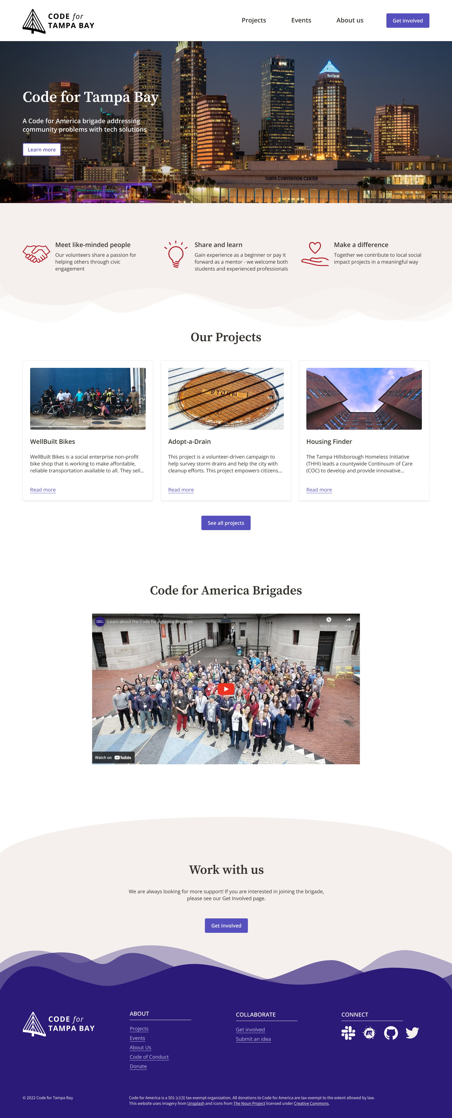
The homepage had iterations to the UI styling of the hero image section, icon section, and project cards to ensure it was easy to understand at a glance.
Lo-fidelity wireframe and hi-fidelity UI of the homepage
Final Design
Simple and informative homepage
Describes the organization’s mission, the types of projects they work on, and the desire for volunteers.
See projects at a glance
I utilized project cards used by another brigade, OpenOakland due to its ability to showcase a project at a glance, including links, overview, and sortable tags. The code for this card is open source since all brigade projects are freely shared, making implementation easier.
Make volunteering easy to understand
Clearly outlined expectations and an overview of onboarding steps help to demystify the volunteer experience.
Reflection
What I learned
Stay adaptable, as processes may change.
Upon discussion with another brigade about widespread issues with volunteering, I discovered there was discussion about some possible solutions including:
A volunteer roster shared with other regional brigades
Shorter term volunteer stints (consulting capacity from experts/seniors)
In user interviews, consider asking about tech they use daily/weekly and how they prefer to communicate.
I found myself wondering if Slack could be used as part of the solution, instead of email, but didn’t have enough insight into what users expect or prefer to use. This question could have helped to inform solutions fitting into an existing flow or tech already used. Communication preferences can also widely differ between age ranges.
Outcome
During this project, I learned that there was discussion about a possible shared volunteer roster between brigades. However, before anything new could be implemented, Code for America announced the sunsetting of brigades, which has left the future of the existing projects very uncertain. Therefore, the website has not been implemented until leadership decides next steps.
NEXT STEPS
If this project were to continue, I would:
Discuss with developer(s) what is needed from me in terms of documentation and other assets to continue with implementation
Learn more about the people who submit project proposals and their goals, motivations, and pain points
Launch the redesigned website and track the change in KPIs such as volunteer inquiries, new volunteers onboarded, and site traffic


